AXOR and hansgrohe North America
Meeting the demands of an ever-growing product assortment
PROJECT ROLES
Creative Direction // Art Direction // Image manipulation
Check it out online!
Aquno Select Kitchen Faucet - Brushed Gold Optic finish [Product Image]
Aquno Select Kitchen Faucet - Brushed Black Chrome finish [Product Image]
Aquno Select Kitchen Faucet - Polished Nickel finish [Product Image]
Talis N Kitchen Faucet - Brushed Gold Optic finish [Product Image]
Talis N Kitchen Faucet - Brushed Black Chrome finish [Product Image]
Talis N Kitchen Faucet - Polished Nickel Finish [Product Image]
Ecostat Diverter Trim - Matte White finish [Product Image]
Ecostat Diverter Trim - Matte Black finish [Product Image]
AXOR Starck Single-Hole Bathroom Faucet, Lever Handle - Brushed Black Chrome [Product Image]
Background
For global brands, one of the most significant challenges is ensuring that product launches are tailored to meet the specific needs of different regional markets. A campaign that performs well in the brand’s home country may not have the same impact in other countries due to cultural preferences, design trends, or market-specific demands. This is particularly true when managing synchronized product launches across multiple subsidiaries, where the same touchpoints may need to be adjusted to align with local requirements.
In this context, I was tasked with leading the creative adaptation of product launch assets for a global manufacturer of bathroom and kitchen products. My responsibility was to ensure that the digital and print materials used for the product launch were customized to meet the needs of subsidiaries in various international markets, while maintaining brand consistency.
The Challenge
The primary challenge was to adapt the product launch materials that had been designed for the brand’s home market to fit the local needs of subsidiary markets. While the original imagery and graphics were effective for the home market, they needed significant adjustments to resonate with the target audiences in other countries.
The adaptations included modifications such as (but not limited to):
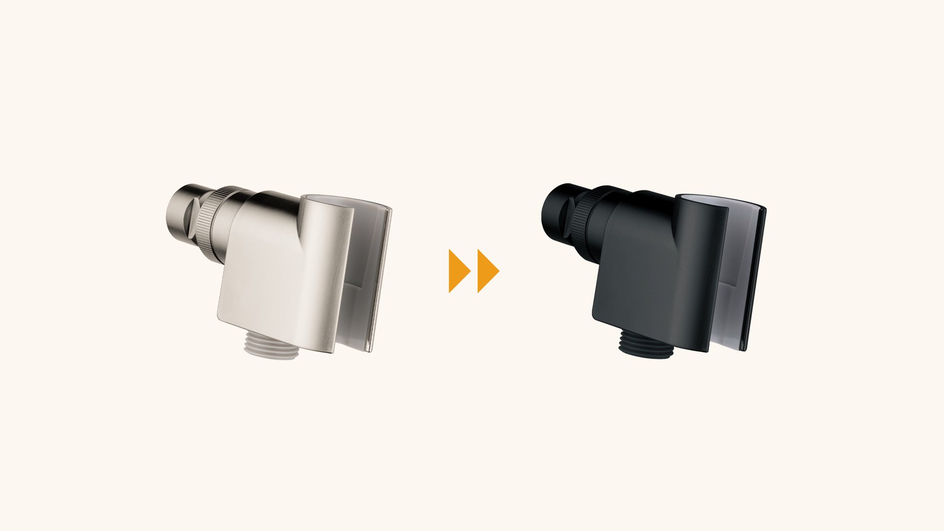
Changing product finishes (e.g., from brushed nickel to matte black) to align with local assortments.
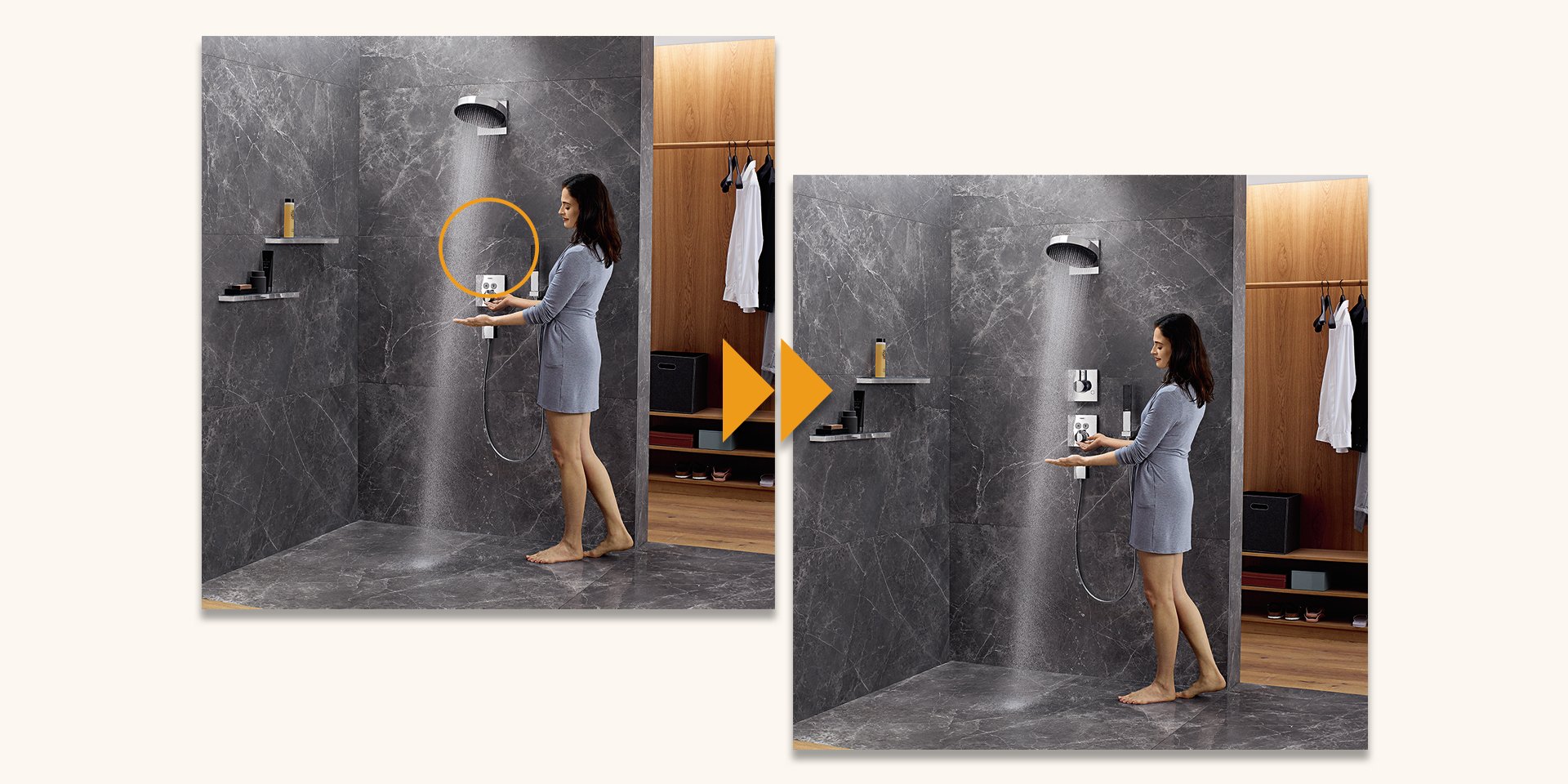
Adding, removing, or replacing products and subjects in photographs to make them more relevant to the target market.
Adjusting graphics, text, and other design elements to ensure that they were culturally appropriate and tailored to local language requirements.
The Strategy
As the lead designer, it was my responsibility to oversee and execute these adaptations, ensuring that each market received a set of materials that was optimized for their specific needs. This required a mix of in-house work and collaboration with external vendors to manage the production and delivery of localized assets.
Execution
Image Manipulations
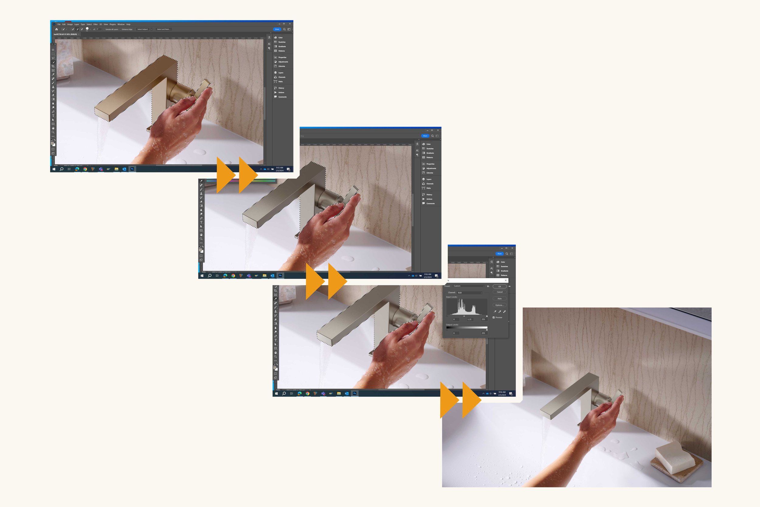
A significant portion of the adaptation process involved image manipulations. This typically included:
Changing Product Finishes: For example, a faucet shown in brushed nickel might need to be altered to a matte black finish for a specific market. This required careful attention to detail to ensure the color changes appeared realistic and high-quality across all assets.
Adding/Removing/Replacing Products or Details: In some cases, products or details in the original imagery were not suitable for the target market. For instance, if the home country’s campaign featured products that were not available in other regions, we replaced them with locally relevant items. Similarly, elements like decorative objects, textures, or even people might need to be swapped out to ensure the photos resonated with local tastes.
Adjusting Graphics and Text: Text overlays, product descriptions, and promotional banners had to be localized to reflect the language, cultural nuances, and marketing strategies of each region. This sometimes involved working closely with local marketing teams to ensure that the messaging was appropriate and effective.
Delegation and Coordination
Given the volume of assets required for the global launch and the various adaptations needed for each market, I coordinated with external vendors, including graphic designers, photographers, and retouching studios, to ensure the final images met both the brand’s high standards and the specific needs of each subsidiary.
In some instances, I also delegated tasks to other team members within the creative department, providing them with clear guidelines and timelines to ensure all deliverables were completed on schedule.
Quality Control
Throughout the process, I conducted quality reviews of all modified assets to ensure that they adhered to the brand’s guidelines while also meeting the specific requirements of each market. This involved carefully reviewing color adjustments, layout changes, and overall image composition to ensure consistency across all assets.
Results
The localized images and graphics were well received by the North American subsidiary and helped ensure that the product launch resonated with local consumers. By customizing the assets to fit regional preferences, we were able to increase engagement and drive sales in new markets.
The ability to successfully modify product imagery and marketing materials for different markets not only helped the global brand stay consistent with its overall branding but also ensured that our subsidiary had the tools they needed to succeed in their respective markets.
Key Takeaways
Tailored Assets for Local Markets: The ability to adapt global marketing materials to meet the specific needs of different markets is crucial for the success of synchronized product launches.
Efficient Use of Resources: By leveraging a combination of in-house work, external vendors, and strategic delegation, we were able to complete the necessary adaptations within a limited timeframe and budget.
Consistency with Flexibility: Maintaining brand consistency while allowing for flexibility in adapting visuals and messaging ensured that the product launch was both cohesive and relevant to diverse audiences.
This project demonstrated the importance of balancing global brand integrity with localized customization, ensuring that each market had the tailored assets necessary to drive a successful product launch.


